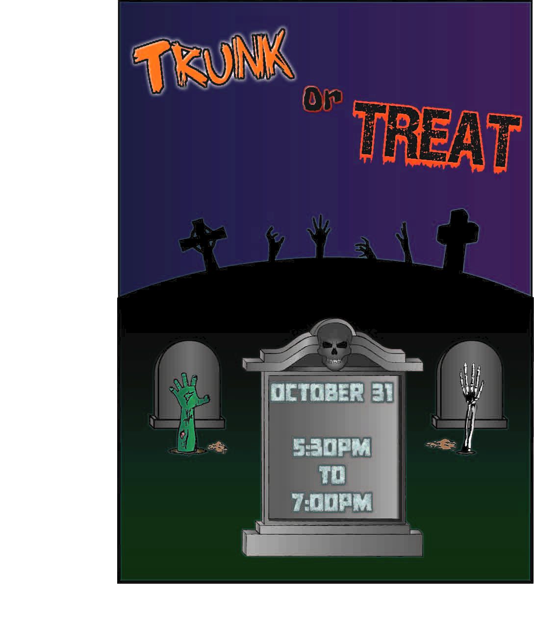
Trunk or Treat flyer -
- Materials _ Adobe Illustrator
- Year _ 2017
- Class _ Graphic Design
Statement: I did this project because I love Halloween, and I've been going to Trunk or Treat since I was 8 years old. It was a time where i could where a mask and be myself and not care about being judged at all. The one i remember the best is my Deadpool costume. It was my favorite and a lot of other people liked it, i got quite a few compliments. I enjoyed hanging out with my family and friends there. In this project, we used Adobe Illustrator. Most of the time I used the pen tool, making shapes and adjusting them, it just seemed like the simplest and easiest, yet something that would have a good result. I also used a lot of gradient, because i wanted to get a shaded look to the gravestones. Since I've been going to this for so long, i liked the idea of making a flyer for it. I really like Halloween and making/drawing "spooky" stuff. I'm overall impressed with the turnout, although when I exported to a JPG and uploaded it, it got a little discolored and added a funny outline to all the black.
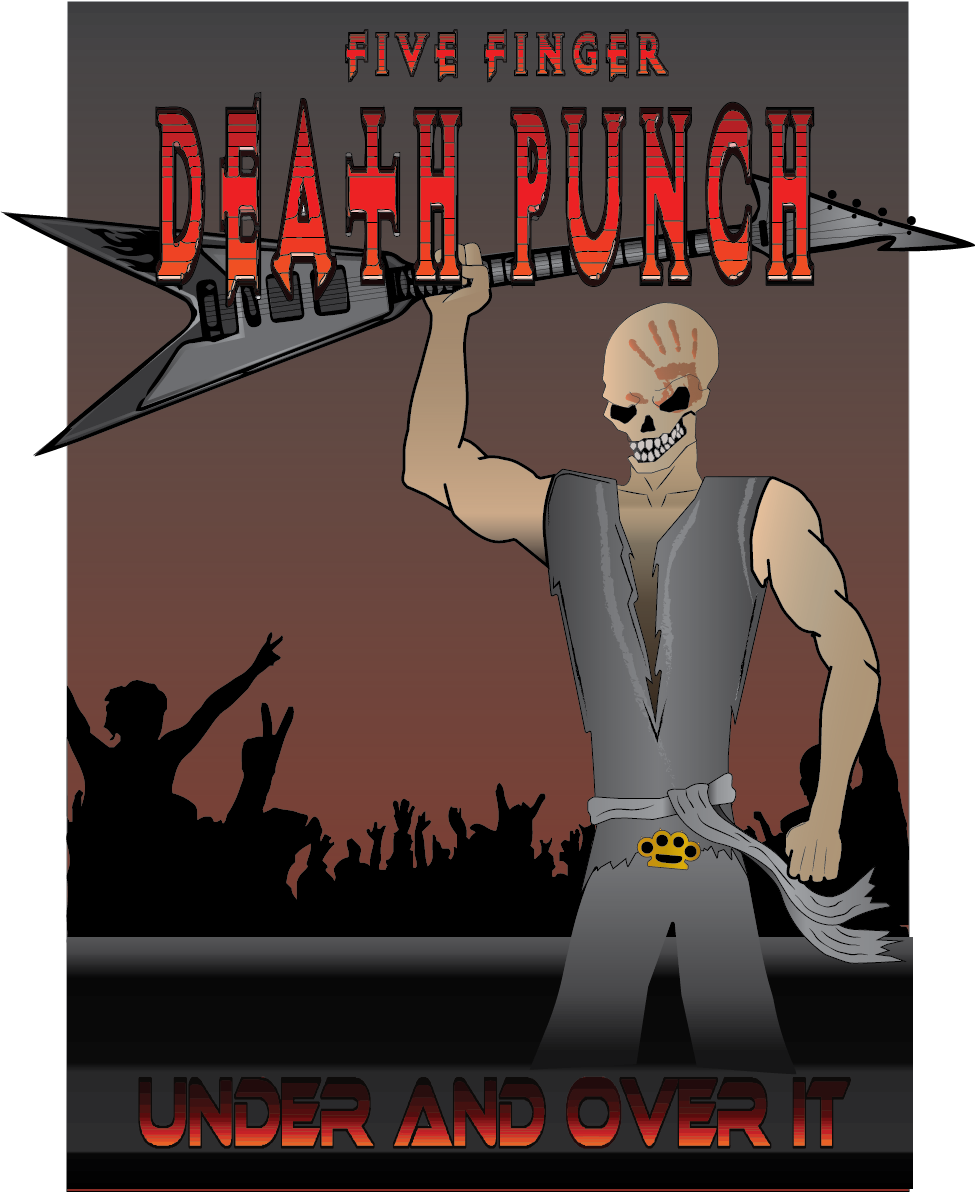
Five Finger Death Punch album cover - Typography
Materials _ Adobe Illustrator
Year _ 2017
Class _ Graphic Design
Statement: I was inspired to make this one mainly because of my love for this band, and just Rock music in general. I've listened to rock since i was a wee little headbanger. I used Adobe Illustrator for this project. For being my second project for my Graphic Design class, it turned out pretty well, i tried a few new things. I could have done a little more work on the waist and leg areas, but overall it turned out okay.
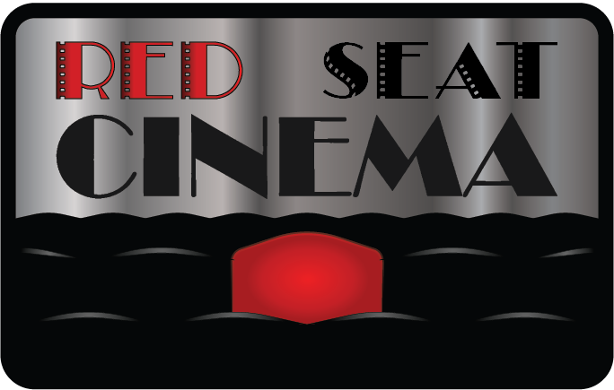
Red Seat Cinema - Logos and Branding
Materials _ Adobe Illustrator
Year _ 2017
Class _ Graphic Design
Statement: The coming-up of this idea was with the help of my brother. We love movies, and going to movie theaters. He came up with the name "Red Seat Cinema" and I kind of ran with that. I wanted to represent that perfect, comfortable seat in the theater. Out of most of my work, this is the most simple one, and it needed to be to kind of fit simple logo idea. To be eye catching but not too much.
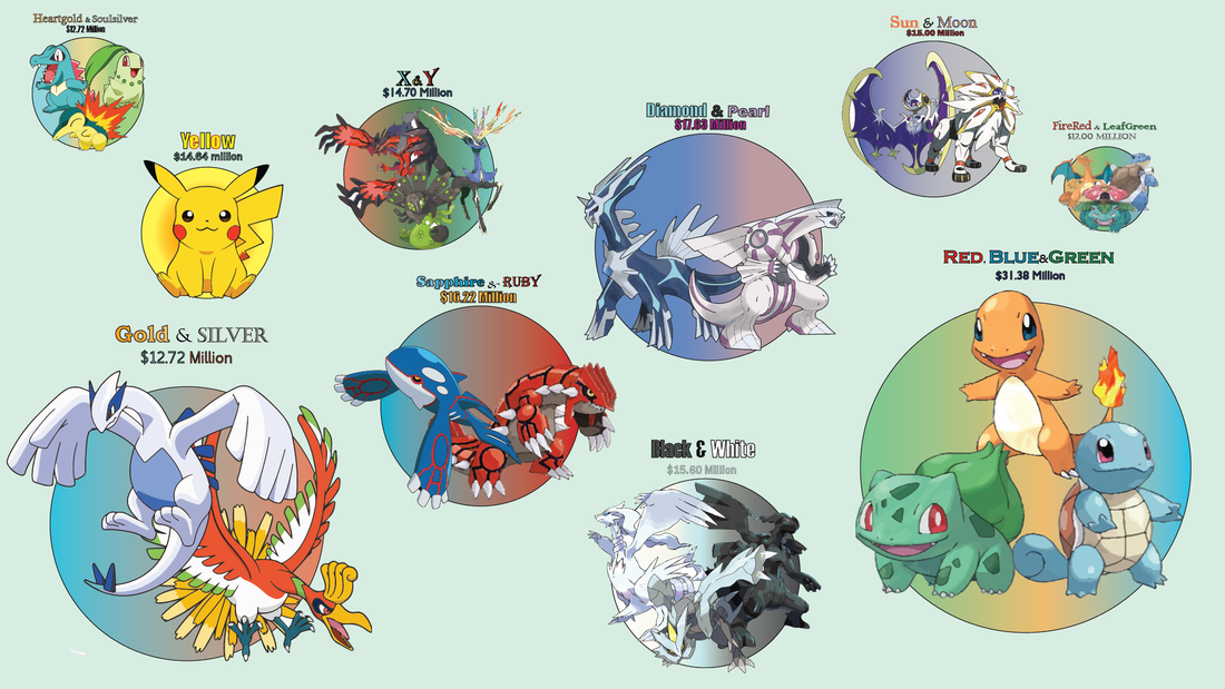
Most Popular Pokemon Games (by gross sales) - Infographic
Materials _ Adobe Illustrator
Year _ 2017
Class _ Graphic Design
Statement: For this project, I wanted to focus on my inner nerd/geek and my childhood. There have been many Pokemon games throughout the years and controversy over popularity. So I figured I could try to help end the confusion by making a simpler graphic comparison of the popularity of the Pokemon games by total gross sales to this day. The size and size of the bubbles indicate the higher grossed games compared to smaller bubbles indicating the gradual decline of sales. I have a pretty big connection with Pokemon through my childhood, along with Digimon. Me and my brothers always argued about which Pokemon was the best or coolest looking, and which one of our games was the best. This project took a lot of patience and working with a lot of fonts, to match up with the theme and mood of the game itself. Overall, it was a better turnout than i thought it would be.
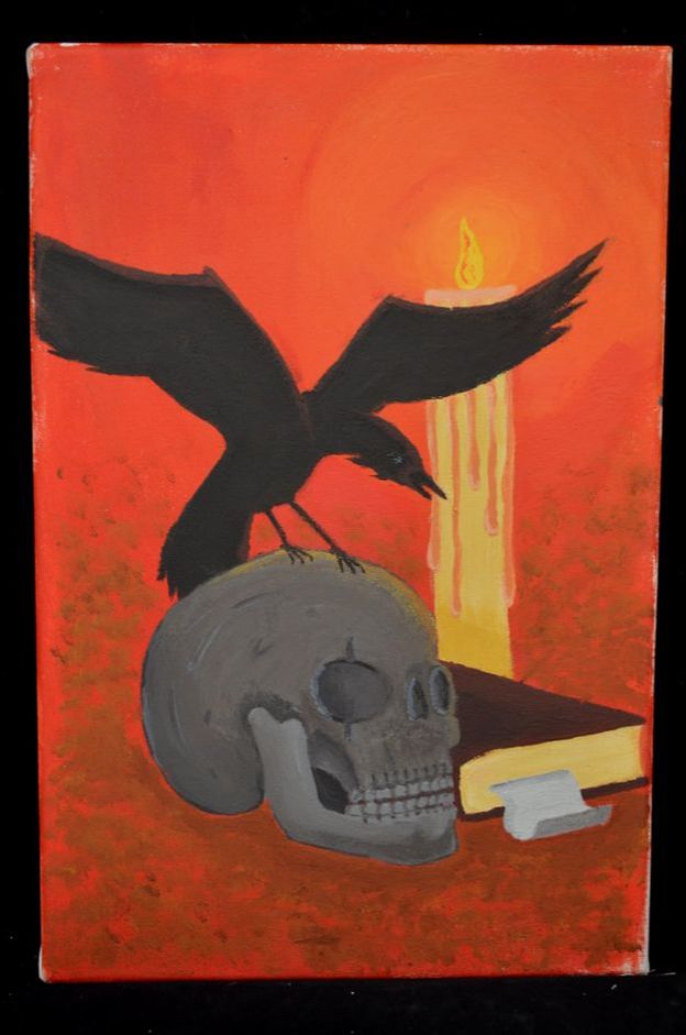
Heraldic Symbol - Raven
Materials _ Acrylic paint, canvas
Year _ 2018
Class _ Painting
Statement: Recently discovering that my heraldic symbol is a Raven, I wanted to start off my first painting in this class expressing that. The Raven is a symbol of knowledge, also divine providence as well as a durable resistance and the bringer of death. So it was hard to put all of that into a painting, but I did my best. To symbolize death, I included the skull, as for knowledge, there is the book. And since providence relates to light, and safety, I decided to symbolize that using a candle, also as the light source. It was something that fit with the rest of the pieces on it as well. All together, this piece turned out very well, even though i redid the skull about a half dozen times.
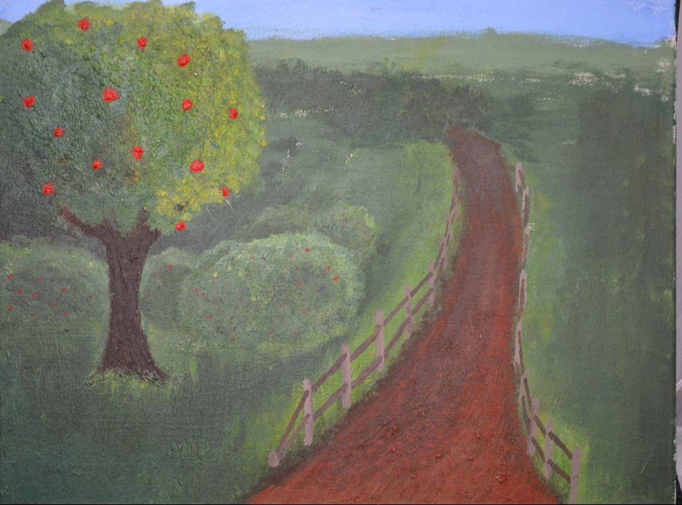
Apple Tree painting
Materials _ Acrylic paint, modeling paste, canvas
Year _ 2018
Class _ Painting
Statement: For this project, we were told to include texture into our painting. So I thought, what better thing to do texture on than a nature scene. I based this painting around my Grandpa's farm, which had quite a bit of untouched land, very over-grown and scenic. One of the main things that me and my brothers would do is go out and pick fruit off of all the apple and mulberry trees. Sometimes we'd eat so much, we'd have to pull of the side of the road to vomit because we ate so much. Those were very fond memories, so I wanted to express that a bit with this painting. I used modeling paste for the trees and the dirt trail. I used a thin glaze material to get light, thin texture for the grass as well. This was quite a time consuming painting, due to all the greens, the wide area of the canvas, and trying to be realistic, especially on the bushes. Overall, this painting turned out alright, although I wished I could have done some more in the background.
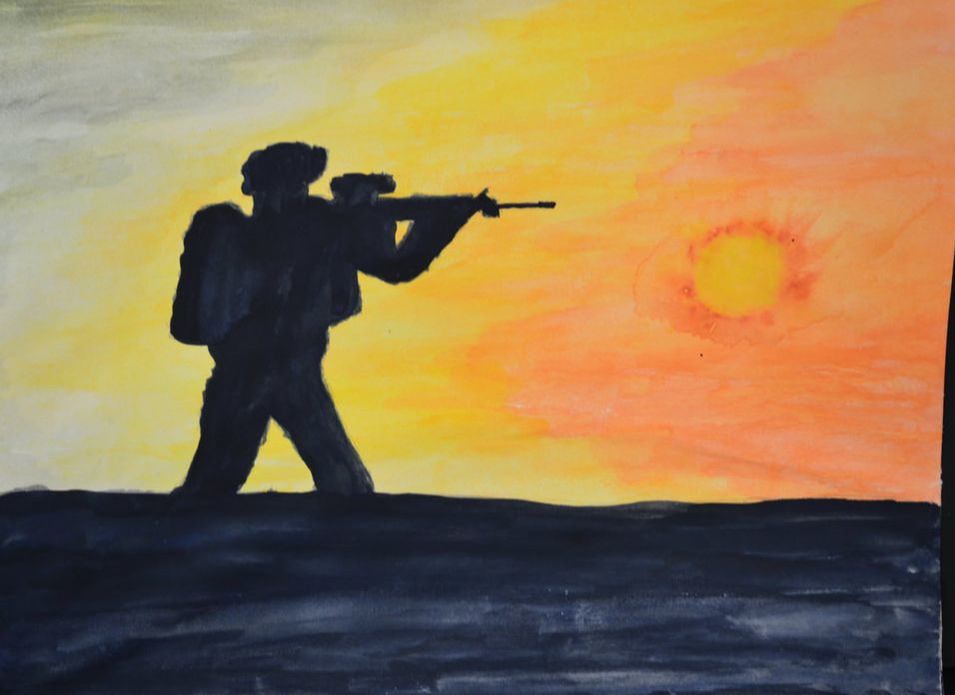
Soldier silhouette
Material _ Watercolor paint/paper
Year _ 2018
Class _ Painting
Statement: I hate watercolor. I don't like how free flowing it is. I like being in control of my paint. This experience was quite difficult, not along the skill area, but more towards my mental area, considering I like being in control of my paint and where it goes. It was difficult for me to let the paint go where it was going to go and do what it was going to do. This project, though, was my way of trying to express my family history of military. I wanted to express that the best I could, even though this is my first time doing a whole watercolor painting.